Tufte is, of course, generally right, although probably nobody wants to encounter a data table on a cocktail menu, either. A menu should not really be data analysis homework.
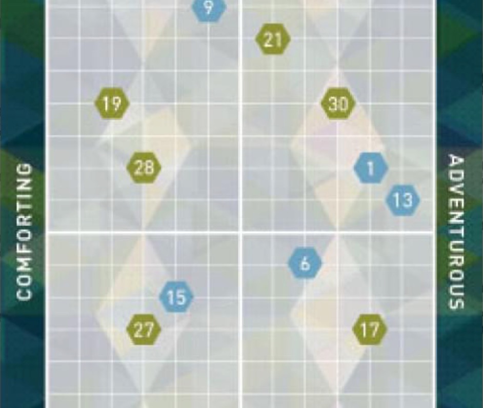
Pouring Ribbons’ menu employed two kinds of graphs. The first was the two linear spectrums:

These were problematic in at least two ways. First, each represents a range between two loose abstractions. Second, their value is mainly comparative between drinks, and the menu is not designed in a way to encourage visual comparisons.
The other kind of graph is comparative, but encoded, requiring the viewer to cross reference index numbers with drinks, with a little color coding mixed in. The abstract nature of the comparison remains problematic.
Consequently, the graphs on the menu are whimsical, but not really that useful, and in my experience, seldom relied on; for most people, it’s just easier to look at the ingredients list and maybe, you know, talk to the bartender. It would have actually been helpful if the menu indicated which drinks were short and which were long.
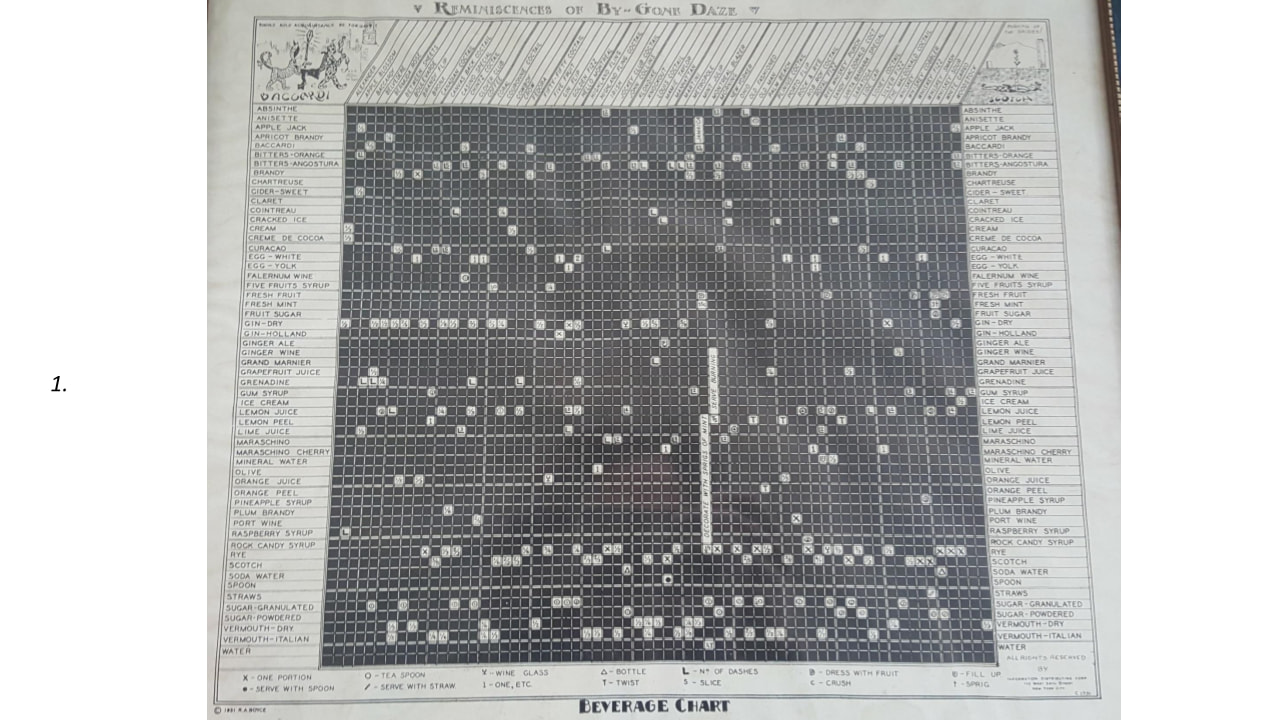
Angelita’s older menu that presented the flavor graphs as “multiples” (as Tufte calls them) that could—in theory—be compared side-by-side. However, it’s a visualization failure because it is too multivariate to visually process without extreme effort. Worse, it’s heavily encoded using symbols and a key. The menu is whimsical, and maybe symbolic of Angelita’s lab-driven program, but nobody wants to deal with all that in a bar. The current Angelita menu is one drink per page, and there’s a graph at the bottom of each page, meaning no side-by-side comparison is possible, but there’s still no real point.
Don’t get me started on flavor wheels: they’re just stunt graphics.
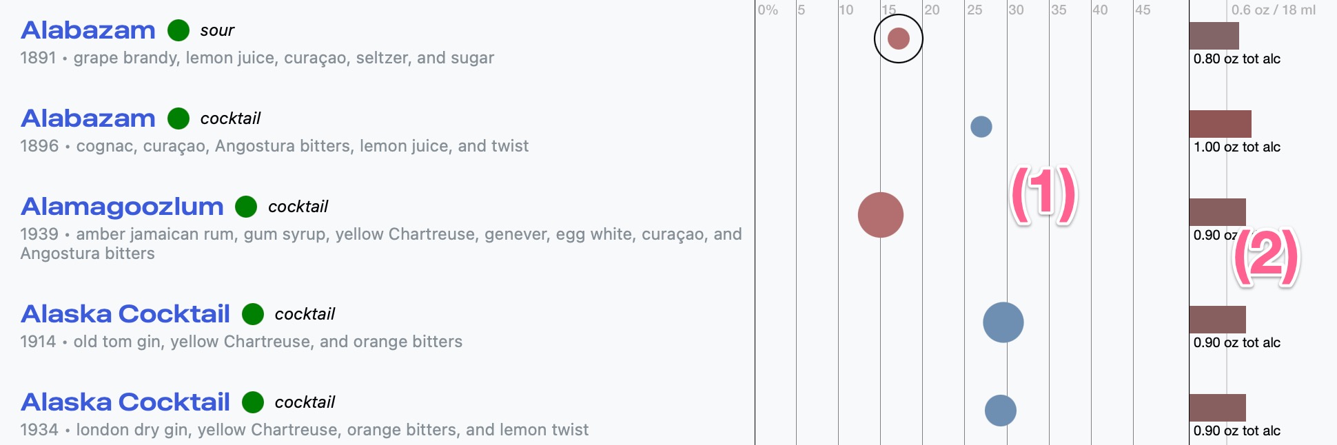
My projects Total Mixology and Beachbum Berry’s Total Tiki Online both employ graphs in a few select situations. They are supplemental in nature, and make some sense given the research context.
On these services, when you look at an index of recipes (if your screen is wide enough) you get a pair of visualizations in columns at the right. They’re in columns to facilitate visual comparison. The first visualization (1) is a variant of that created by Dave Arnold in his book Liquid Intelligence, that expresses three aspects of flavor concentration: ABV, sweetness and acidity. Once you know how to read the graph, you can immediately see that the two Alabazam recipes are wildly different, with the first being dramatically more diluted and acidic than the second. You can see that the first Alaska recipe is sweeter than the second. The second column of graphs (2) represents the absolute strength of each drink relative to one standard US drink, and in comparison with each other. In this case, all five drinks are similarly on the stronger side.